
What Is a Call to Action in Digital Marketing?
If you run digital marketing channels, you've probably heard of the phrase call to action. But what does it actually mean in digital marketing? How can you improve your call to actions? And why are they so important when it comes to generating leads or making sales through a website?
In this guide, I'm going to explain exactly what a call to action is, why it plays such a major role in website UX, and how you can improve your buttons and prompts to increase conversions.
So let's get into the tutorial.
What Is a Call to Action?
A call to action, often shortened to CTA, is a prompt on a website that encourages the user to complete a required action.
This could be something simple like:
Add to Basket
Checkout
Contact Us
Download PDF
Start Free Trial
The goal of a call to action is to guide the user towards the next step that the business wants them to take.
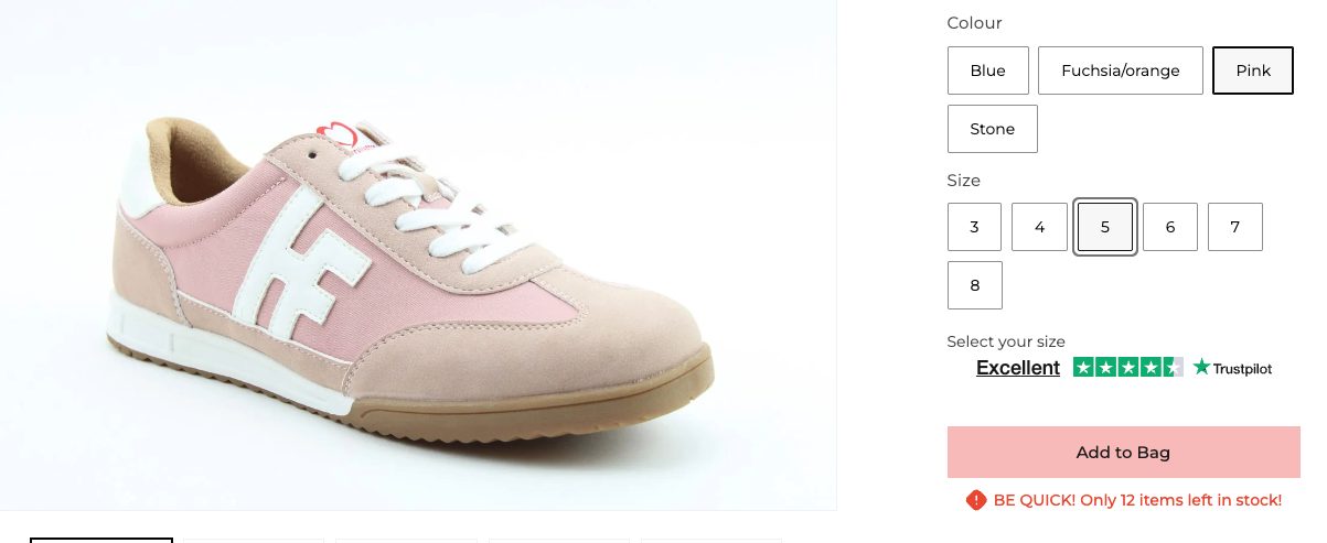
For e-commerce websites, CTAs are usually focused around purchasing products. For example, clicking an "Add to Basket" button moves the user closer to making a purchase.
For lead generation websites, the CTA might look slightly different. It could be something like:
Download PDF
Request a Quote
Book a Consultation
Get a Free Audit
In these situations, the call to action is designed to collect a lead rather than process a sale.
Call to actions are now a major part of website UX because users already understand how they work. People know that clicking a button should take them to the next stage of the journey quickly and clearly.
The easier you make this process, the better the overall experience tends to be.

Why Call to Actions Matter
A strong call to action can make a huge difference to the performance of a website.
Without clear CTAs, users may not know:
What to do next
Where to click
How to contact you
How to complete a purchase
This creates friction in the user journey, and friction usually reduces conversions.
A good CTA helps:
Improve lead generation
Increase online sales
Streamline user journeys
Improve website usability
Support your overall digital marketing goals
Even small changes to a button can sometimes improve conversion rates significantly.
For example, changing vague wording into something more direct and obvious can remove uncertainty for users.
How to Improve a Call to Action
There are several things you can do to improve a call to action on a website.
Keep It Simple
One of the biggest mistakes businesses make is overcomplicating their CTA wording.
As Steve Krug mentions in Don't Make Me Think, websites should be simple and intuitive to use.
Your call to action needs to make immediate sense.
For example, avoid unclear wording like:
Download This Thing
Click Here
Learn More Stuff
These types of CTAs create uncertainty because users don't fully understand what will happen when they click.
Instead, make the action obvious:
Download PDF
Get Quote
Book Consultation
View Pricing
The clearer the button is, the less hesitation users will have.
Use the Right Colours
Colour psychology can also influence how users interact with call to actions.
You generally want your buttons to feel inviting and easy to spot on the page.
Many websites use:
Brand theme colours
Green buttons for positive actions
Contrasting colours to draw attention
Green is commonly associated with positive actions or "go", which is why it is often used for checkout buttons or enquiry forms.
The key is making sure the button stands out clearly from the rest of the website without looking overwhelming.
You also want consistency across the site so users become familiar with your CTA styling.
Send Users to the Right Page
Another important factor is making sure your CTA takes users to the most relevant page possible.
A lot of websites lose conversions because they add unnecessary steps into the journey.
For example, if you are promoting a specific product:
Don't send users to a category page
Send them directly to the product page
If somebody clicks on a featured product CTA, they already know what they are interested in. Adding extra steps only increases the chance of them dropping off.
The same applies to lead generation websites.
If your CTA says "Book Consultation", the user should go directly to the booking page, not the homepage.
Keeping journeys streamlined helps users understand exactly where they are in the process.
Common Call to Action Mistakes
Here are some common CTA mistakes I regularly see on websites:
Too Many Buttons
If every section has multiple competing CTAs, users can become overwhelmed.
Try to focus attention on the primary action you actually want users to take.
Weak Contrast
Buttons that blend into the background often get ignored
Your CTA should visually stand out.
Vague Messaging
Unclear wording creates hesitation and confusion.
Always make the outcome obvious.
Poor Mobile Experience
Many websites forget to optimise CTA buttons for mobile users.
Buttons should be:
Easy to tap
Clearly visible
Fast loading
Positioned properly on smaller screens
Conclusion
Call to actions are one of the most important elements on any website because they guide users towards completing a desired action.
Whether that's generating a lead, downloading a PDF, or making a purchase, your CTA should always be:
Clear
Simple
Easy to understand
Positioned correctly
Relevant to the user's journey
Even relatively small improvements to your CTA wording, colours, or placement can help improve conversion rates and create a better user experience overall.
If you're looking to improve your website performance or generate more leads through digital marketing, feel free to get in touch via my contact page at Jonny Swift PPC. I'd be happy to discuss how PPC and website optimisation can work for your business.